Tuesday 25 June 2013

semi-final


      NO. 14


part


detail

“composition of fragmentation”, it mainly concerned itself with disjunctive compositions and 

diagrammatic fragments, two paintings with different sensibilities are trying to be dominant.


The family colors between washed-paper, the primary color of painting and the string I chose 

were pull and push viewers’ sight, I tried to force some further aspects with the experiences to 

achieve both distance appreciation and view in a close range, the numbers of ways like 

collage, stitching, reconstructing, cutting-out, the comparison between drawing and actual 

images or stitches. The reconstruct process drove whole fragments together as parts of my 

organic artwork.


details


Thursday 20 June 2013

Talk Notes.


I get the feeling that these two works have been jammed together

The sensibility seems very different

Interesting use of black and white images

The cut out trees, the sky

Are  more ordered and controlled

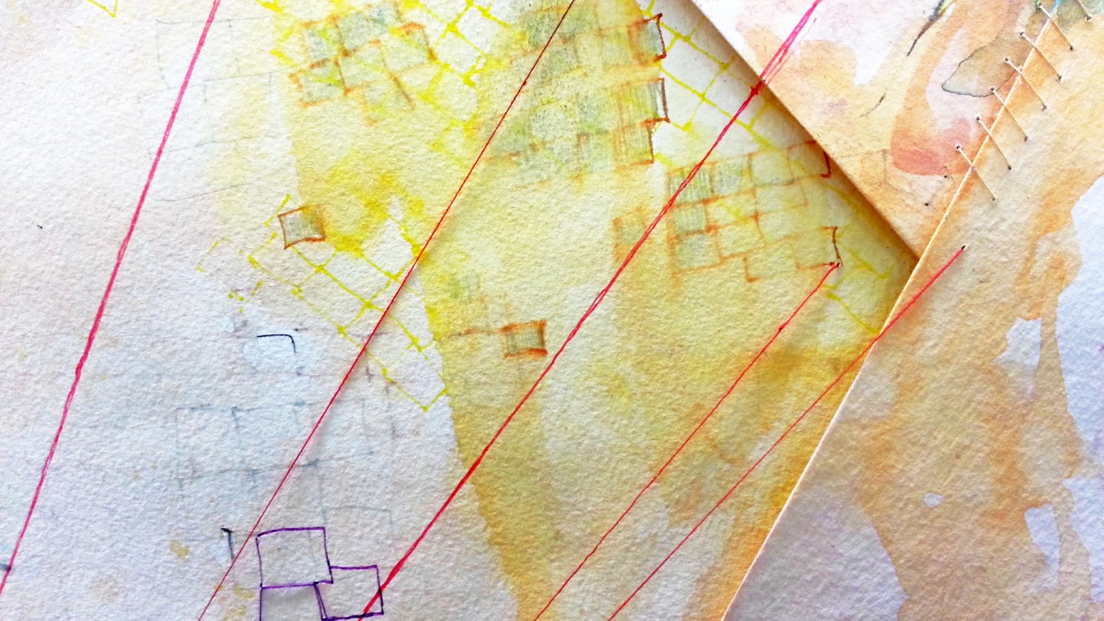
I like substance  of the work and the little squares here, from far away I didn’t notice they were sewn and I thought they were drawing.

You can see the relationship between the paint she has used.

A subtleness  kind of thing

I see the images as diagrams, there is a graphic design context

These images are closed up where the string joins

I would not imagine the colour and the cut outs together

Is it more about the diagram rather than the diagramatic

I find everything interesting but they work as two separate works

It is kind of a mad and I like that

It is the disjunctive  things I like that are really hand done

The work is disorientating, I like the idea but I do not like being forced to look at it

Colours match, ie thread and paint, a family line of connection.

Why the big black mount board

It is a throw back from primary school

It is a part of painting yet it isn’t

The top has a chalky effect to it, they do look very similar but different and I like the idea of each one trying to be dominant

Cut outs feed the idea of it being soft and architectural

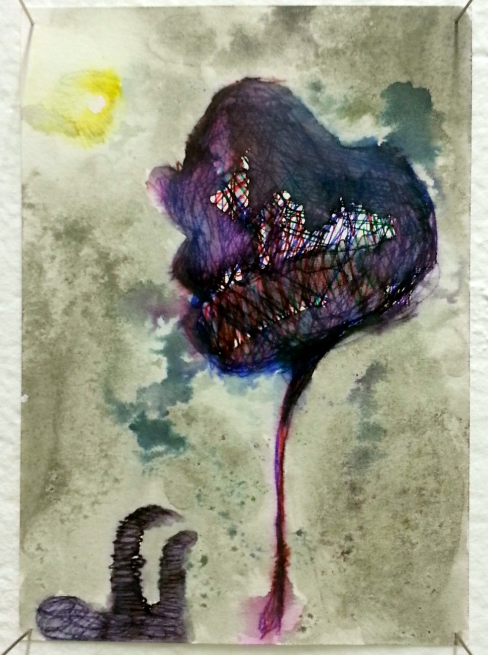
Industrial, buildings, electricity, structured, organic intervention


Abstract/expressionism

The hand drawn grid sense of blocks is very soft, the softness is much more ofthe body I 

want to see it playing off against

Grid - For me it makes the most of it

The idea of stitching together and using small thread is interesting.

These are incomparable qualities

The force of the connection.  Does this come with this

I feel like I am looking at a diagram of the internet, this comes with this etc

Force the disconnection, eg Ian’s story about incompatible materials

Deconstructing  the idea of making something completely new

The easy selection would be to pull something out

Thomas Edmonds

I think something else is going on here.  I like the different mosh-ups

my response - I would like to see them as complete opposites

Albert Olan

Placed elements in a violent way.  Play around with scale

Everything within this image is of a certain amount of dimension, getting a push and pull

Julie Mehretu

If the black paper was measured there would be a bit more drama, the more of a thinking about the black paper

How would it be if something touched the image

We may be seeing the beginning of something

Recognise each one of these elements as a thing as opposed to a background and a device

Constructing something

I think there is room for the ........................ to be more coherent

Shergy Jensen

If this is the conversation that moves into the collage of images are from elegant??

Highlight the soft stained  patches and then the tougher lines

This is a very delicate, quite slow, procedure

I feel like it is supposed to be growing out more

It wants to be organic or somewhere else

Saturday 15 June 2013

something about CLAY 3 (drawing)


I was thinking that if the clay would become soft in moist condition, how about totally soak into water...


As you can see, the clay block melted and became little bit sticky, after times stirring, the character is very similar as flour except the amount of thickness is less.

P.S  use hot water can speed up the integration of time.


This is when melted clay and water balanced, very trick and smooth oyster white liquid. 

I added oil pastel ash, it would not absorb, just flout on the surface, very colorful.


Pour the liquid onto a watercolor sheet, it standstills on above and absorb into paper slowly.

I tried shake the paper to increase the speed of absorption.


It was wet, after half an hour (studio was warm)...


Dried and left clay spots, also the oil pastel ash stayed with the trace.

Is there have difference when the order of oil pastel ash into clay liquid changed?

oil pastel drew onto paper already brushed with clay liquid

clay liquid brushed onto paper with oil pastel lines

Yeah it is has difference, the first one stayed but the second one melted and absorbed during more clay liquid added.


Sunday 9 June 2013

Michael Raedecker


Dutch, London-based artist Michael Raedecker good at using mixed media to explore 

familiar places and objects in everyday life. He found them on secondhand books or 

magazines, like bed, telegraph pole, table cloth etc. as a painter he did paintings on large scale 

canvas, but it is interesting to see the medium of embroidery on such surface.


Usually he likes use beige or grey-blue color to explore the nostalgic feeling in his works, this 

kind of color is so ambiguous and feminine, same as the embroidery skill, besides he used it 

in an architectural and masculine way, “Raedecker is brilliant in his combination of what are 

each classified as traditionally feminine and masculine arts”


His solo exhibition “Line-up” 2009 had high commendatory, there are fine string, rough 

thread and hair stitched into canvas over a layer of poured paint, he threw out the idea of 

inwrought pattern combine with painting and the considered construct was fitted each other 

well, also the colors he has chosen can see as a family line of connection, the traces of broke 

up the objects on the surface into fragments can found in details, this ambiguity between 

painting and thread really inspired me.


detail


detail


Palmor, L. (2009). Michael Raedecker: Line-up. Retrieved June 16, 2009, from


Tuesday 4 June 2013

Combination 4


I started to develop the pigment liner-washing painting part which I tried before, I really like the blur after use watercolour washed the pigment liners, so unpredictable and spiritual, also the comparison of watercolour and pigment liners.


This one is a larger work, also it is another experiment of the washing method I want go further, because the colour I used was quite colourful and busy, how to find the balance is a kind of difficulty, how to build up layers is a challenge, I mean for example, this painting below is an unfinished piece I'd like to keep going, but after added a cutting out layer which is one of the method I want be in my work, it turned to something I do not want and do not like.

   NO.12 (unfinished)


    NO.12(failed layer adding)

The minimal pattens work well I think, it is quite invasive, what if create a busy scene and enormous scale work...

Zoom in, the mirror effects — the patten in the found image and painting detail. 


NO.13


Monday 3 June 2013

John Reynolds


New Zealand artist John Reynolds, he had a range of practice basic on simple, repeated and 

abeyant shapes, he called this project the “plates”, different visual languages displayed 

similar. In his artworks, there is always a vision of diagram, a multiplicity of possible reading 

and a sense of humor.


“Kingdom come” 2001, it is colorful small-scale lines across canvas, numbers of square-like 

fragments layer over layer, the first glance, there can’t see any particular orders just busy 

and giddy grid patterns, but after focus it brings a shift of rainbow’s colors and an emotion of 

a primary event in abeyance, also you can just read it as a composition diagram.


“Kingdom come” 2001


Reynolds, J. (2001). Summer. Wellington: Govett-Brewster Art Gallery and Artspace.

Erika. Congreve, R. and Gibbs, J. (2002). The Walters prize. New Zealand: Ernst &Young.

John Reynolds Nietzsche on Whites Beach. (1996). Retrieved 2013, from

John Reynolds: Hevn Not To Scale. (2002). Retrieved October 2002, from


Sunday 2 June 2013

artist Chris Braddock with his clay works (drawing)


Check this out:          http://vimeo.com/54972329


" Chris Braddock is an artist and academic. He is Associate Professor of visual arts in the School of Art & Design, AUT University, New Zealand, and Chair of the AUT ST Paul St Gallery. His art practice involves performance, video and sculpture. His theoretical research stems from the disciplines of art history, anthropology, and performance studies. Key terms that underscore Braddock’s art and writing: performative sculpture, part-object/ part-sculpture, moulds and casts, material trace, absence and presence of the body, labour of making, modes of participation, performance and its documentation, animism, contagion, art and spirituality, blasphemy."


He did a whole series of body works by using clay (epoxy clay) in 2010, like "2 pushing", "3 pushing shoulders", "3 passing" etc. also the show which just finished in April, "the Material Traces: Time and the Gesture".


In his performance, you can see a very strong relationship between arts' body and the object (here is epoxy clay), there involved a lot of actions, like punch, press, knock, break in, squeeze, mould etc. seem like all about body strength to me, he used every parts of human body to deal with one object or we can say the material — clay.

Also there is a thing about him I really like to say, he got his own way document his works, whatever it's a action, a performance or a sculpture, like the "push" (2003), he recorded the performance of his own gestures by a role of sculptures and description with categories.


 "Braddock has developed the standard categories of documentation such as provenance, materials, techniques and contexts resulting in an extraordinarily detailed and obsessive description in line with the project’s overall concerns of self-reflection with a focus on the methodologies of how things are collected as well as what."

According to his works and the way of document, I sensed those extraordinary details are interesting and playful, through the martial find the reflection of self, that is something I'd like to try...


http://www.christopherbraddock.net/about/        CHRISTOPHER BRADDOCK

http://arden.aut.ac.nz/portfolio/chris.braddock      AUT ART+DESIGN

http://www.christopherbraddock.net/artworks/new-work-2003/      PUSH 2003

Saturday 1 June 2013

something about CLAY 2 (drawing)


  • Interesting phenonenon: traced not noly the forms of knuckles, but also the fingerprints.
  • can see it very clear even fine lines without waiting until it dry.


  • the knuckles' models like some kind of puzzles, or fossil remains of animals.


  • they are settle but can define as little fragile, see what if smash with a hammer.


  • next step I decide to make some tiny bits, just give a try, I'm wondering the result.
  • roll the clay up.


  • under the rolls is a washed canvas, comparison of grey and colours.
  • by chance, I feel maybe it can be a 3D work.


  • because of the temperature in studio raised, I found that some of clay bits I covered by a damp towel returned to soft, and could be reused.
  • after some research of this non-firing clay, acturally it can be stored in a tightly closed plastic bag and put indefinitely in a wet towel.